What is the Minimalist Paradigm?
My approach to eBook formatting, which I call the "Minimalist Paradigm," is by design--simple. I put in the bare minimum of formatting. Meaning:- Chapter titles as headings (h1 or h2 tags)
- Paragraph spacing
- Paragraph indent
- Bold, Italics and centering as needed
- Link chapter headings to table of contents
- Format chapter links not to look so much like links
Why the Minimalist Paradigm?
I am a computer programmer that builds websites and web applications for a living. So I know a lot about HTML and CSS which are the technologies behind eBooks.The number 1 reason I use the minimalist paradigm: It looks good on pretty much in all apps and programs and on all devices and screen sizes.
That's really the heart of it. Having a single source file that looks good everywhere. You see, an eReader or an eReader app is not like a physical book. It's layout is not fixed. It changes dynamically based on the screen size and user settings. On most eReaders and eReader apps the user can change a lot of things including the font, text size, margins, text color, and background color.
Also, each eReader and eReader app brand has a slightly different way of handling the eBooks. By keeping it simple you have less of chance of running into special cases that require the file to be "tweaked" in order to look correctly.
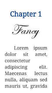
Below I provide some screen shots that illustrate the point, especially about using images in eBooks.
Oh, and the number 2 reason I use the minimalist paradigm: it saves a lot of time and effort. Bonus--the files are smaller.
An Example
I compiled to sample eBooks. One is "fancy" meaning it contains images. And the other is "simple" meaning it uses only my minimum formatting. You may download them and see them in action if you like. Here are both in the Kindle Previewer, as you can see they both look nice. Although the fancy chapter title adds a little extra flash.| Fancy | Simple |
| Fancy | Simple |
| Fancy | Simple |
| Fancy | Simple |


No comments:
Post a Comment